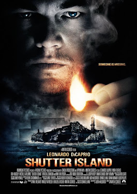
Inspired by my recent post on The Dancing Image, I'm going to initiate a feature here which looks over a director's career by combing over the posters for his films. I think this will be fun because it not only gives us a sense of the filmmaker's development but of the transformation of pop cultural aesthetics over time. We'll start with Martin Scorsese:


6 comments:
I've always really loved those posters for After Hours and Bringing Out the Dead. Certainly, they stand out here as the most graphically interesting of the designs. And I wonder if it's just a coincidence that they're also among Scorsese's "small" films, and thus not quite as bound to the beloved-by-studios big-floating-heads design.
Great idea, MovieMan. Movie posters have always been the unsung hero of movie marketing. Strange, since it is usually one of the first pieces of publicity that provide the film with exposure, and they are often a wor of art onto themselves.
I hope to see a lot more of these types of posts in the future.
Ed, good point. I'm also struck by how all of Scorsese's posters, from past to future focus on the "gritty" aspect of his aesthetic. They don't really capture the uber-cinematic quality of his work; not sure how a poster can, but sometimes they suggest it. Not so much here. These are mostly blocky, dark, grainy, very un-romantic. I think they may have informed my impression of Scorsese as a little kid when I first heard his name and hadn't seen any of his films. You get the sense of dim lighting and dirty streets and washed-out film but not really passionate bursts of energy and dynamic camera moves and rhythmic editing...
Tony,
That's the idea. Every week I'd like to do this with a different director. I'm going to try & establish a sort of system on the Sun's Not Yellow especially as I develop my writing for other sites - the 21st century series for Wonders, an upcoming series for Dancing Image, and hopefully weekly contemporary reviews for a site in the works (the paying one, to sort of supplement Examiner). The system would be every week, a screen-cap post, a director's posters post, maybe a random post here and there, and hopefully one written review which I can keep to about a 3-paragraph capsule. Should be easier to manage both a steady output here & work elsewhere if I follow that route.
I love the movie posters for older Scorsese films, but the newer posters seem to focus on the "stars" of the films, the floating heads, as Ed said. Commercialism has destroyed artistic integrity.
"A movie for everyone who has ever dreamed of a second chance"
Not for me, then. I've always wondered about the marketing strategy of these kinds of taglines. It's welcoming some people in and pushing others away.
"If you like cars, then yo-"
Lost me.
"Nobody knows Rupert Pupkin but after 11:30 tonight no one will ever forget him"
Now that's a tagline, and Scorsese's best film too.
Marcy, I think that approach has been more pronounced lately - look at the movies themselves, full of floating heads in extreme close-up, most shots concerned with conveying some type of information through "signs" rather than conveying a mood or texture. I think it was always present to a certain extent in advertising - and strongly in the older days as well as the present one, but it does seem like there was "in between" period of at least the 60s & 70s where there was a lot more room to experiment, and it wasn't assumed that audiences needed to be spoonfed, that perhaps they preferred to be seduced subtly. Or maybe not, but that's my impression anyway.
Stephen,
Not at all my favorite Scorsese, but agreed - it's a great tagline!
Post a Comment